
Localization and languages
Set the locale
Universal Checkout supports multiple languages out of the box, enabling you to adapt its UI to the relevant market. You can specify the language using thelocale option. If not provided, the locale is automatically derived from the browser:
Typescript
Universal Checkout automatically falls back to English if the provided locale is not supported.
Supported locales
Right-to-left
Universal Checkout automatically switches to a right-to-left layout for the relevant languages. Make sure to pass the rightlocale to activate right-to-left:
Typescript
Styling Universal Checkout
You can use the general styling options to style specific UI elements such as form inputs, text labels and several other elements within Universal Checkout.Typescript
Text Styling Options
Text elements within Universal Checkout can be styled using the following interface:Typescript
Block Styling Options
Block elements within Universal Checkout can be styled using the following interface:Typescript
Styling Inputs
Styling Font Family (Card Input)
Universal Checkout style inherits from the style of its container as most of it is rendered directly within your page and not within aniframe.
So any font-family that you have set in the CSS file will be used by the Universal Checkout. The example below uses MyFont as the preferred font family for card input.
CSS
iframe. This means that font-family declarations, and @font-face directives that load and define fonts are not passed to these specific fields.
To forward font-family and @font-face to the card input fields, you can set style.input.base.fontFamily and style.fontFaces.
Alternatively, to style.fontFaces, you can forward stylesheets to the iframe using the style.stylesheets option, which facilitates the integration of fonts coming from services such as Google Fonts.
Typescript
InputStyle Options
You can style all the inputs on Universal Checkout in all their different states. By default, theInputStyle defined in input:base will be used everywhere. You need to add value for InputStyle only if you wish to override this style for inputLabel, hover, placeholder etc.
Typescript
Typescript
Example
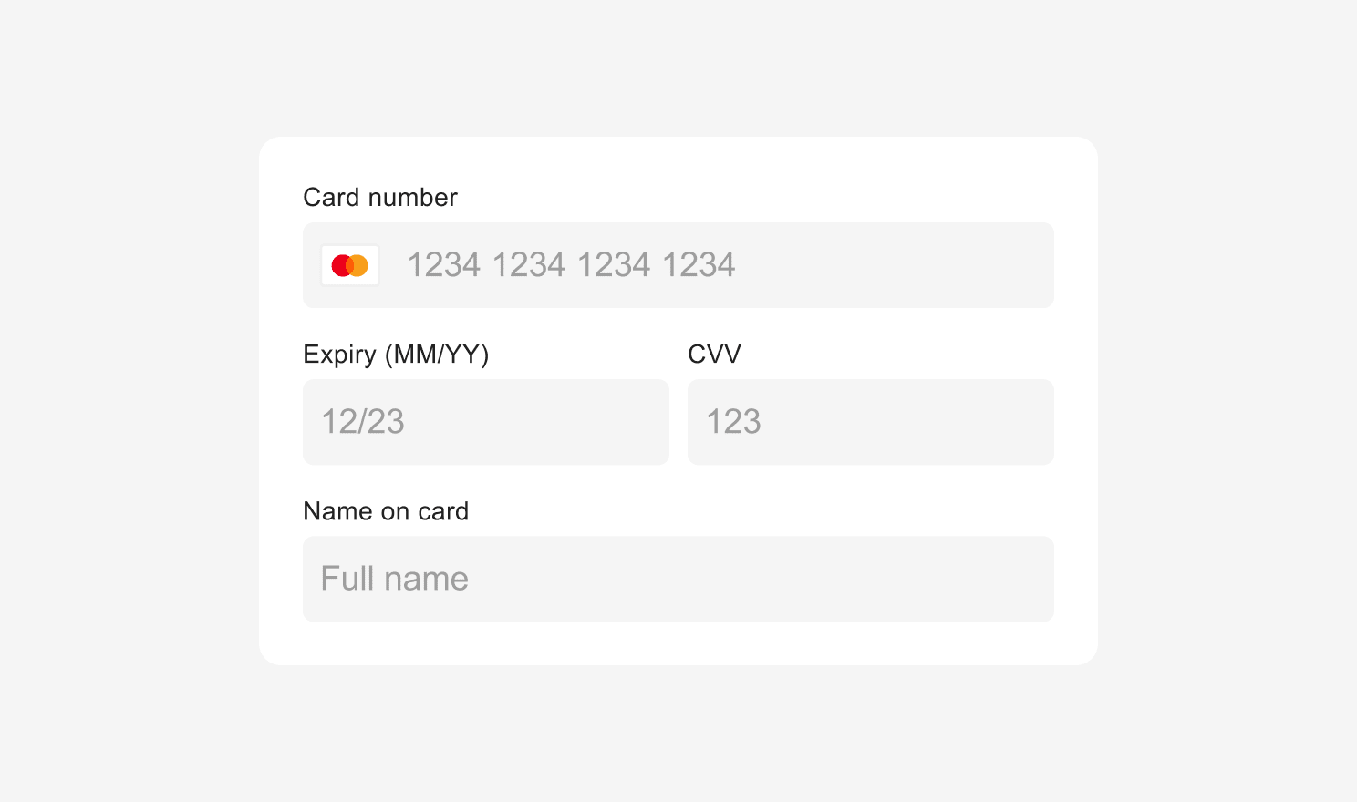
Styling Example
Typescript
Typescript
Styling Input Errors
You can customize the style of Universal Checkout error state. By default, theInputStyle defined in input.base will be used everywhere. But you can override this where you need different error message styling by specifying the style for input.error and inputErrorText. inputErrorText also uses TextAlignmentStyle.
Typescript
Typescript
Example
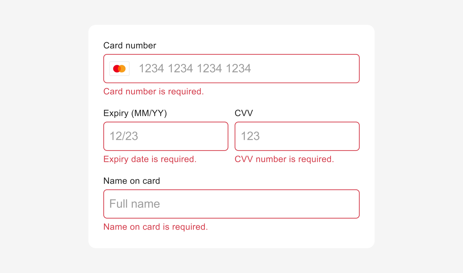
Error Input Styling Example
Typescript
Styling Error Messages
You can also style the error message shown in the event of an unsuccessful payment usingErrorMessageStyle interface which extends Block Styling Options and Text Styling Options mentioned above.
Typescript
Styling Form Spacing
You can change the vertical spacing between inputs or the spacing between labels and inputs by using theformSpacings properties.
Typescript
Styling Submit Button
The default submit button in Universal Checkout can be styled to match your brand. ThesubmitButton uses TextStyle and BlockStyle to define the style of the button.
By default, the style defined in submitButton.base will be used everywhere. If you wish to override the default style for loading, disabled, hover or focus or other states, you will be required to add values for TextStyle and BlockStyle properties.
Typescript
Example
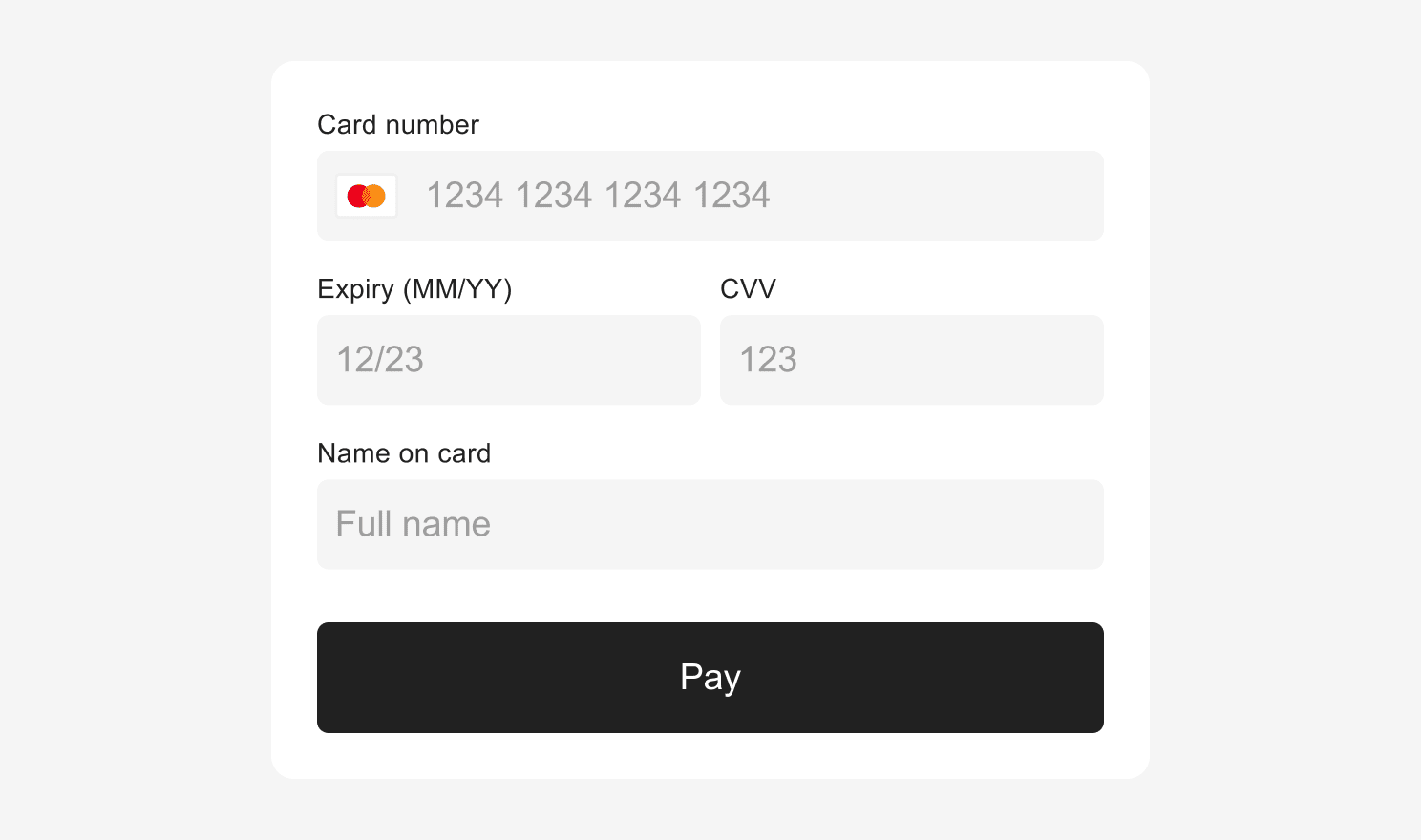
Submit Button Styling Example
Typescript
Styling Back Button
Some scenes in Universal Checkout will have a back button which allows the user to navigate back to the previous scene. You can style the back button as shown below:Typescript
Styling Transitions
When multiple scenes are present in Universal Checkout, you can override the default transitions to better match your website transitions.Typescript
Typescript
Styling Loading indicator
While Universal Checkout loads, a loading screen indicator is displayed to the customers. You can customize the color of the loading screen indicator as shown below:Typescript
Styling Vault
By default, any previously vaulted payment methods are shown to customers in Universal Checkout. This happens only when thecustomerId is included in the client session.
Typescript
Styling Vault Display
The vault display in Universal Checkout can be styled if you wish to change the defaults.showMorePaymentMethodsButton uses TextStyle to define the style of the button. By default, the style defined in showMorePaymentMethodsButton.base will be used everywhere. Add values for TextStyle only if you wish to override this style for the disabled state.
Typescript
actionButton uses TextStyle to define the style of the button. The confirmButton uses both TextStyle and BlockStyle interfaces.
Typescript
Displaying Custom Errors
In case of an error, Universal Checkout presents a default message to the customers. This error message can be disabled if you wish to display a custom error message.Typescript
Displaying Pay by Card Button
By default, the card form is automatically displayed on the first scene of Universal Checkout. You can replace it and display a ‘Pay by Card’ button instead of the form. Clicking on the button will show the card form on another scene.
Pay by Card
Typescript
card.preferredFlow field:
DEDICATED_SCENEEMBEDDED_IN_HOME(default)
style.input property. The pay with card button can also be styled, if you prefer not to use the default styling. See Styling Payment Method Button for details.
Styling Payment Method Button
ThepaymentMethodButton uses TextStyle to define the style of the button.
Typescript
Displaying Custom Submit Button
The Universal Checkout now enables you to use your own custom submit button. Follow these three simple steps to replace default submit button with your own custom one:Step 1. Hide the Built-in Submit Button
Typescript
Step 2. Forward clicks to checkout.submit()
Typescript
Step 3. Dynamically Update Your Submit Button
The Universal Checkout expects the submit button to be visible and enabled in specific conditions. You don’t have to care about these conditions - the Universal Checkout will tell you when and how to display the Submit Button.Typescript
Handle Multiple Submit Buttons
Each callback has a second argument calledcontext with the currentSceneId. This enables you to determine which submit button to show/hide, enable/disable, or modify the content.
In addition, the onVisible callback also contains previousSceneId in the context object. This enables you to hide the button of the previous scene if necessary.
Typescript
Success Screen
By default, what happens afteronTokenizeSuccess depends on the payment method that the customer chooses. Some of them require the display of a screen that summarizes the order.
It is recommended best practice to show a success screen once the payment is validated. You can use the successScreen options to determine whether to show a built-in success screen or a custom one.
The available built-in success screen types are 'PAYMENT_METHOD' and 'CHECK'.
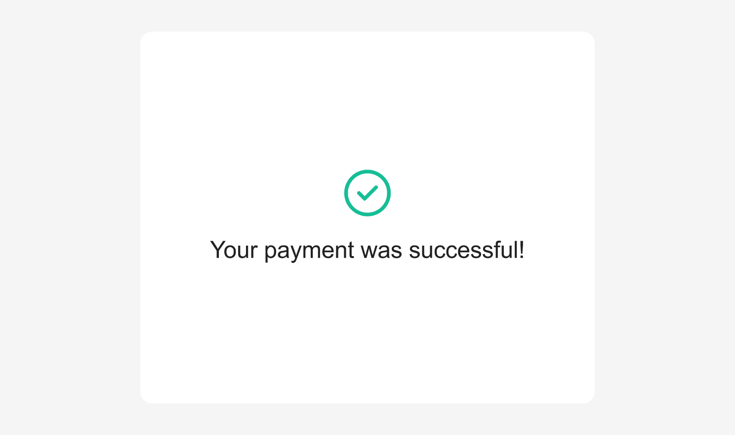
Success Screen - Check
Custom Title
When using'CHECK' as a success screen type, it is also possible to specify a custom success title which will be displayed under the success check mark icon.
Typescript
successScreen to false overrides the default behavior so that you can show a custom success screen after onTokenizeSuccess is called:
Typescript