Every part of the customer journey leads to one moment: pressing pay. Merchants should have complete control over how customers experience that moment, but until recently the tools available forced a trade-off they shouldn't have had to make.
Move fast with a rigid drop-in, or gain flexibility at the cost of months of engineering with a headless build. That was the choice.
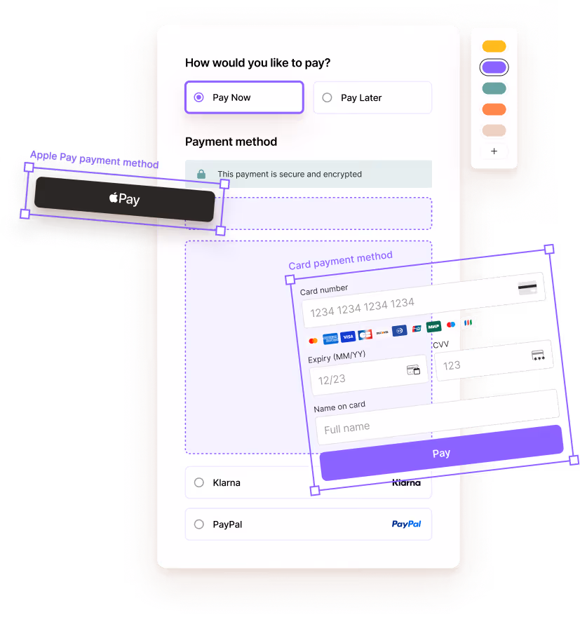
So last year, we changed that. We launched Primer Checkout: a component-based checkout SDK built on a modular, low-code architecture that gives merchants complete freedom over their checkout experience, without the complexity that's always come with it.
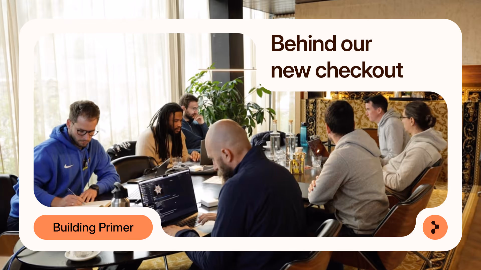
This is the story of how we got there.
Listening before building
Before writing a single line of code, we spoke directly with merchants. We expected requests for incremental improvements: finer control over colors, spacing, or typography. Instead, those conversations revealed a much broader set of requirements.
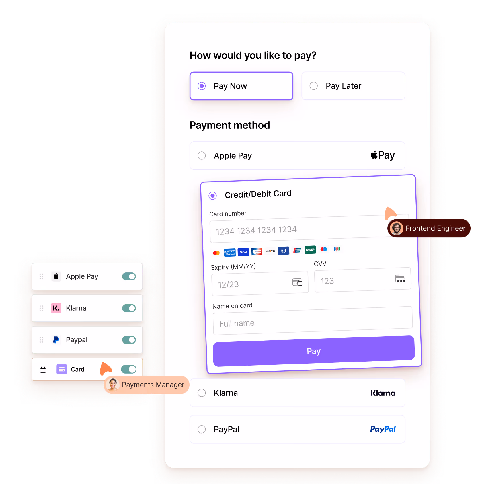
Teams wanted to influence borders, button behavior, layout structures, conditional rendering based on order value, dynamic ordering of payment methods, and more advanced interaction patterns. They wanted their checkout to feel like a native part of their product, without taking on the cost of a full headless implementation.
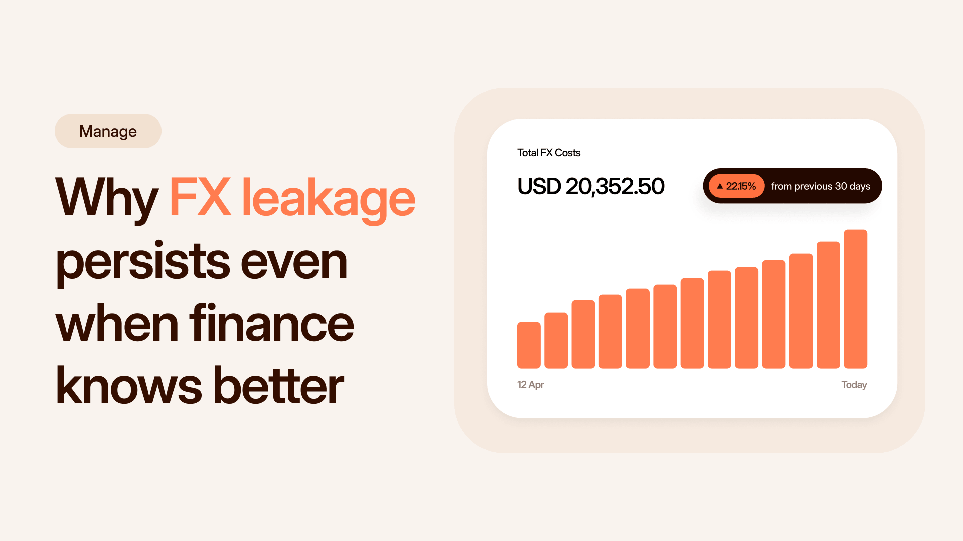
One theme came up again and again: experimentation. Commerce moves quickly. Customer expectations evolve, new payment methods emerge, and small design choices can have a disproportionate impact on conversion. The ability to experiment continuously, safely, and at scale is what enables businesses to stay ahead, and build the highest-converting checkout possible.
The level of granularity merchants asked for made it clear that an evolution of our existing offering couldn't evolve to meet these expectations. While we offered choice with both drop-in and headless solutions at the time, improving one or simplifying the other would have only reinforced the same trade-offs merchants were already facing.
To give them the control required without adding complexity, we needed a modular architecture that lets merchants shape the checkout around their own workflow, rather than adapting their workflow to an SDK.
Defining the vision, exploring the hard ideas
With these requirements in front of us, our next step was to define what the underlying architecture should enable. We wanted an experience that supported far richer customization than drop-in allowed, but we also wanted the integration to remain simple and predictable. We needed consistent behavior across web, iOS, and Android, and a model that would scale without introducing fragmentation.
To explore potential foundations, our team gathered for a workshop where every idea was on the table. What became clear is that we needed to rebuild our checkout from the ground up to be highly composable, with as few lines of code as possible, and built to help merchants convert.
To get there, we evaluated the latest technologies and architectures. For example, we explored Kotlin Multiplatform, which promised a shared core that could be used by all of our different platform SDKs.
In theory, this would have let us centralize logic while reducing the size and complexity of the individual platform SDKs. But the limitations became clear quickly. Kotlin Multiplatform performed well on mobile, but the JavaScript and web environments required too many workarounds. For every issue solved, more appeared. So we made the call to move on.
At Primer, we're not afraid of exploring and failing fast, and stepping away from this idea was a turning point. It pushed us to focus less on theoretical elegance and more on what would practically give merchants a reliable, high-quality integration experience.
Finding the right path forward
To validate our direction, we began to focus our exploration on the Web SDK. This was the fastest place to prototype different UI approaches and understand how flexible the new checkout could become.
Revisiting ideas from our workshop led us to Web Components. Because they're native to the web and framework-agnostic, they gave us a foundation merchants could build on without compromising the consistency of the underlying architecture.
Within weeks, we had a working proof of concept. Our iOS and Android teams mirrored this approach, using platform native tools but maintaining a shared interface across all SDKs. The result was a unified design model without forcing a unified codebase.
Working together in new ways
A deliberate part of this rebuild was also to improve how our SDK teams collaborated. Before this work, each team naturally focused on its own platform, which meant “less cooks” but also led to fewer opportunities for ideas to cross-pollinate.
Something as central as Primer Settings differed across React Native, iOS and Web in both naming and argument structure. This made behavior harder to predict and created unnecessary friction for merchants and for our own teams alike.
As we defined the new architecture, we set an explicit goal to unify how behavior, configuration, and customization were modeled across platforms. That meant working across SDK teams in ways we hadn't before.
Part of what made that possible was embracing AI as a working tool. It handled the repetitive work: migrating payment methods, generating early documentation, building demos, and maintaining parity between mobile SDKs. That gave our engineers the space to focus on cross-team problem solving and the decisions that actually mattered.
Through this process, we became more aware of each other’s challenges, more willing to share approaches, and more comfortable jumping in to help one another across the different platforms. Patterns developed in one SDK often informed how we shaped components in another. It made for a stronger, more connected engineering culture across the team.
A new standard for checkout
Looking back, what this rebuild came down to was a refusal to accept the original trade-off. Merchants shouldn’t have to choose between a checkout that’s easy to build and one that genuinely reflects their brand. They shouldn’t have to choose between shipping fast and having full control.
That conviction shaped every architectural decision we made. The component-based model, the style variables, the shared interfaces across web, iOS and Android. All of it was designed so that merchants can build what they actually want, not a compromised version of it.
We launched Primer Checkout last year and merchants have been building on it since. Today, the record for a fully-customized checkout integration is around four minutes. That’s the result of bold thinking, a willingness to experiment, and frequent conversations with our merchants.
We build for them, not for ourselves. This rebuild is a reflection of that principle at every step.
If you want to learn more about the product itself, you can read the full announcement here.
.png)